Done during my internship at Firefish.
Inspired by De Stijl and Bauhaus movement.
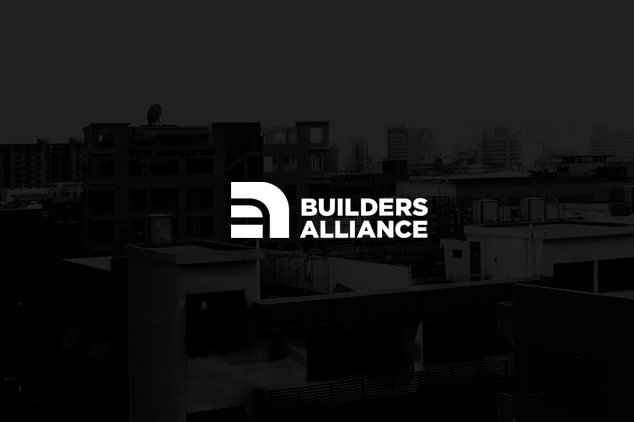
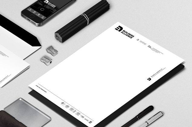
The Builders Alliance’s brand captures their mission statement of delivering building excellence. Embracing the basic form of shapes, the logo conveys the brand’s strong foundation.
The quintessential shapes of square and circle, inspired by the Bauhaus movement, also reflect their extensive experience and technical expertise in all aspects of the building industry.
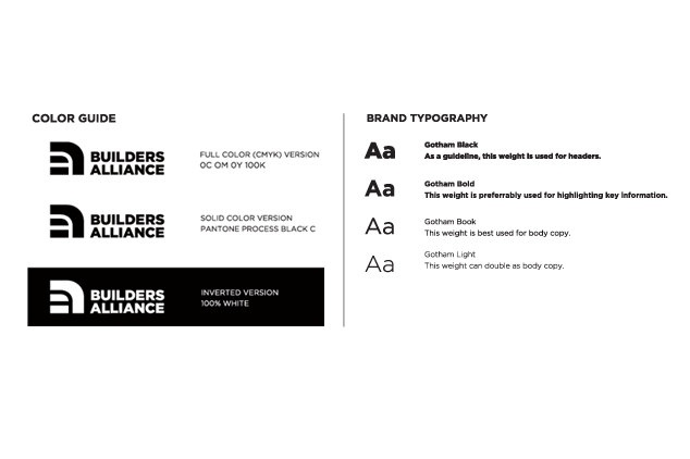
The strokes inside the rounded square can be seen as either a “B” or “A” or a combination of both, which emphasizes brand recall. The use of bold type and stroke gives the brand strength and vitality. In a single colour of black, the brand embraces a singular and united mindset to deliver building excellence for their clients.